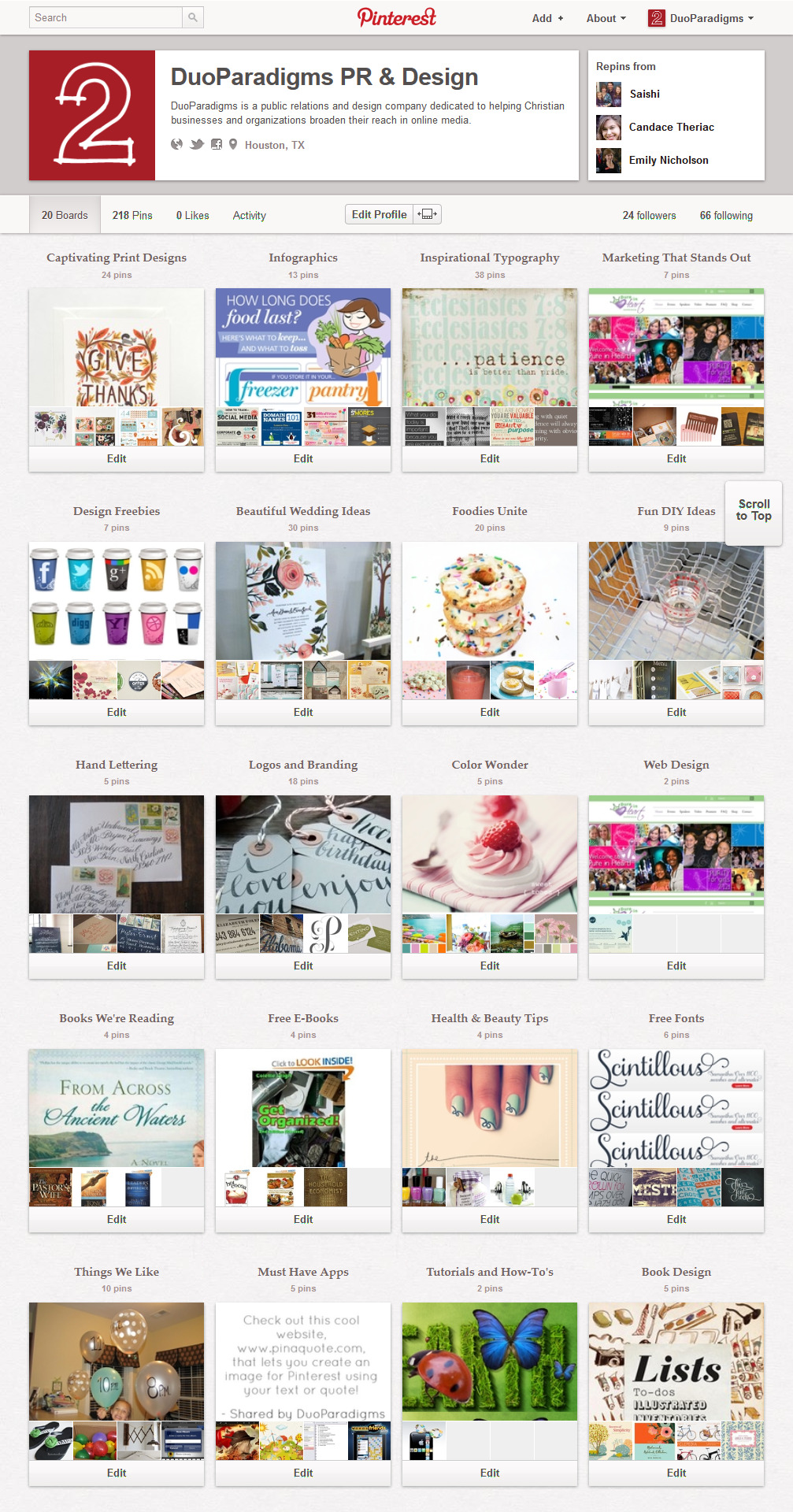
If you logged into your Pinterest account this morning, you might have been greeted with a brand new interface.
Unlike many of the countless changes Facebook has been bound and determined to make, Pinterest’s team has successfully managed to refresh their design scheme—while still retaining the beauty and simplicity of the service.
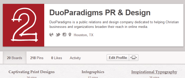
For businesses, one of the appealing features of the redesign is more prominence being given to the personal information about the board owner. Brand recognition on Pinterest just got a wonderful shot in the arm.
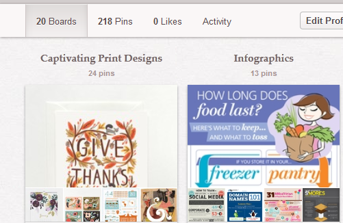
Tabs have been introduced, so you can flip between your pins, likes, etc.
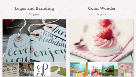
I love how the boards appear at a glance, with the larger thumbnail flanked by the smaller graphics. Visually, this is just stunning.
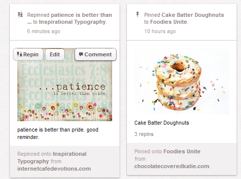
The new Recent Activity view is also very eye catching and well-organized.
I’m sure there will be a slight learning curve as Pinterest users need time to adjust to the changes, but overall, it is a big step in the right direction for a company that just appears to be getting better and better.
Follow DuoParadigms on Pinterest at www.pinterest.com/duoparadigms!
[nrelate-related]Our newsletter will help you grow your Christian business or ministry online:
Disclosure: Some of the links on our website are “affiliate links.” This means if you click on the link and purchase an item, we will receive an affiliate commission. We only recommend products or services that we feel will add value to our followers. We are disclosing this in accordance with the Federal Trade Commission’s 16 CFR, Part 255: “Guides Concerning the Use of Endorsements and Testimonials in Advertising.”

