When it comes to marketing, the humble milk carton is a success story.
Growing up, I was a label reader. I’d sit at the table and read every label in sight. Ketchup, cereal, butter, you name it, I read it. I saw examples of mediocre design—-and very good design.
When it comes to the milk carton, it has a readership that probably rivals some newspapers. So what marketing lessons can be learned from such a simple, yet practical product?
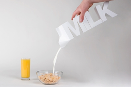
1. Originality
Be daring. Stand out from the pack and design something that’s original and eye-catching.

credit: Julien De Repentigny & Gabriel Lefebvre
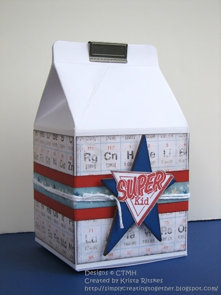
2. Color
Think outside the box, quite literally, when it comes to your product’s color scheme. This kid-friendly design is sure to capture your little one’s attention and make breakfast more fun.

credit: Simply Creating
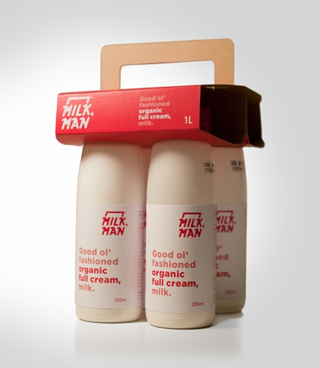
3. Classic Appeal
While color is important, class is equally as important. This trendy milk jar branding is a throwback to the days when milkmen still delivered.

credit: The DieLine
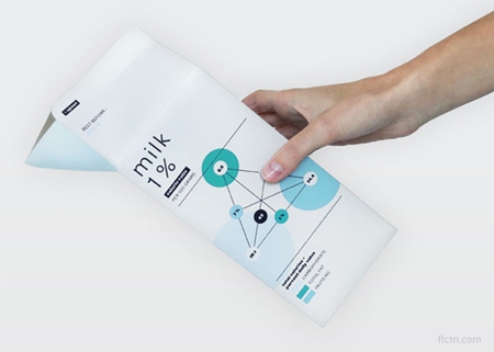
4. Informative
If eyeballs are going to read your design, give them something worth reading. This innovative milk carton is actually an infographic.

credit: Audree Lapierre
Our newsletter will help you grow your Christian business or ministry online:
Disclosure: Some of the links on our website are “affiliate links.” This means if you click on the link and purchase an item, we will receive an affiliate commission. We only recommend products or services that we feel will add value to our followers. We are disclosing this in accordance with the Federal Trade Commission’s 16 CFR, Part 255: “Guides Concerning the Use of Endorsements and Testimonials in Advertising.”

